Back by popular demand is the column that all readers love, Tyler’s Top 10.
After an extremely controversial list last week, this edition of the JOURNAL is sure to raise a few eyebrows and get the conversations flowing at local grounds on Saturday and Sunday.
With two-seasons of white ball cricket nearing conclusion, it’s time to rank the best one-day kits across the local teams.
10. Endeavour Hills (VSDCA): A terrific mix of both the gold and the green, with the change of colour in all the right places on the collar and the pants. The hats work well with this kit and despite making the top ten, it comes in as tenth because GAZETTE photographers captured a gloveman rolling with green pads on his gold pants, that’s a big no-no!
9. Carlisle Park Vikings (WGCA): A selection that posed question marks in the JOURNAL office. The Vikings kit has a few things that win big ticks; numbers and names on the back are excellent for all journalists and the contrast with the yellow on the darker back is just sensational for the vision impaired.
8. Berwick (DDCA): The Bears don’t do a lot wrong on the cricket field and they’ve delivered again with a delightful one day kit. The name of the club on the front is a rare sight in one-day kits in this era, it’s usually only rolled out in World Cup’s.
7. Narre Warren (DDCA): The Maggies kit is marvellous. While it may not be the best sun smart option with the fully black kit, it certainly is easy on the eye. What needs to be taken into consideration with this kit is how easy it is to keep the black kit matching with black helmets and proper black pads (no clads). If it wasn’t for how sun smart we are at the JOURNAL, this could break into the top five.
6. Pakenham Upper Toomuc (WGCA): Proverbial’s are certainly on the line when pulling on the canary yellow, but don’t the Yabbies absolutely rock it! The only thing that needs to be corrected with this kit is the coordination with lids, can’t be having a navy blue helmet with this kit.
5. Dandenong (VPC): A very traditional kit this one, like Narre Warren in the earlier mention, a navy blue based kit makes it easier to shop for supplies. The fade on the side is terrific as well as the old-fashioned lettering smack bang in the middle.
4. Casey-South Melbourne (VPC): The Swans wouldn’t have made Tyler’s Top Thousand with their old kit, the plain red shirt and pants was horrendous, but this new look V with an exuberant Swan is top-tier. Despite it being the second year worn, it could be why the Swans are rising up the VPC ladder.
3. Frankston-Peninsula (VPC): A very under-appreciated kit this one. The Heat has a lot of colours to work with and they do it perfectly. The fade through the tail of the short, to the yellow numbers on the back. The more you look at it, the better it gets.
2. Heinz Southern District (DDCA): HSD are just percentage out of the Turf 2 top four, perhaps this ranking will be the boost it needs to launch into finals. The separate coloured pants and shirt don’t usually bode well, but the cobra on the front is mesmeric.
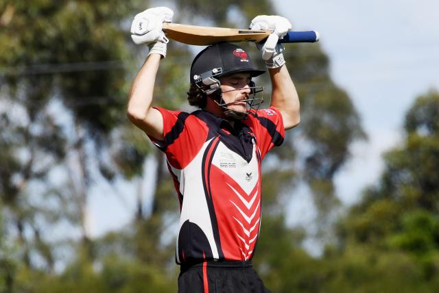
1. Cardinia (WGCA): Similar colour scheme to the second-placed kit, but the Bulls take the cake. There is so much going on in this kit – particularly the shirt – but it somehow works perfectly. The slashes below the V shouldn’t work, but do. A very worthy winner of this week’s Top 10.

