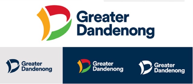
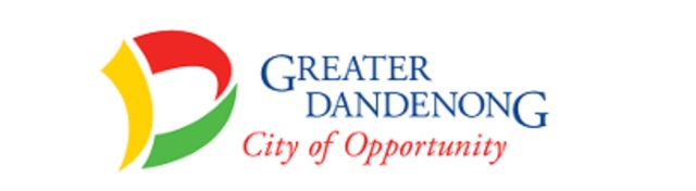
After nearly 20 years, Greater Dandenong Council’s logo is set for a proposed subtle rebrand.
The update would replace the ‘City of Opportunity’ slogan with a “more contemporary”, bolder sans-serif ‘Greater Dandenong’.
The prominent ‘D’ in red, yellow and green would be retained – but in what appears to be slightly deeper hues.
A monochrome logo option would also be added.
“The font and typography would be modernised to appear more contemporary and meet modern standards of accessibility,” states a report to be tabled at a 26 May council meeting.
The revamp would also “improve brand consistency and clarity”, “readability” and “enhance community trust”, the report states.
The current logo was introduced in 2006 – the red signifiying business and industry, yellow for community optimism and harmony, and green for environmental best practice.
The logo’s evolution was in keeping with the change in Google’s logo over time – gradually using a “rounder, more open and legible font” to improve accessibility, the council report stated.
The ‘City of Opportunity’ slogan would be used more sparingly in future.
Councillors will vote on the new logo on 26 May.